I’m going to tell you a secret that changed our business forever and skyrocketed our client’s marketing results.
Are you ready?
Build standalone landing pages for your campaigns.
Sounds simple, right?
Like almost bordering on silly, simple.
Well, let me tell you a quick story.
A case study that proves the point
We used to run Google and Facebook Ads to our client Easton Motors’ website. We thought they had a pretty solid conversion rate in the 3-5% range.
With a 3.33% conversation rate, you need 33 visitors to your page to get a conversion.
With a 5% conversion rate, you need 20 visitors to your page to get a conversion.
So for this client, we needed somewhere between 20-33 visitors to get a conversion, aka a lead for their sales team to sell to.
From what we could see in their Google Analytics and HotJar screen recordings, it looked like a lot of people would hit the site, then browse the vehicle inventory.
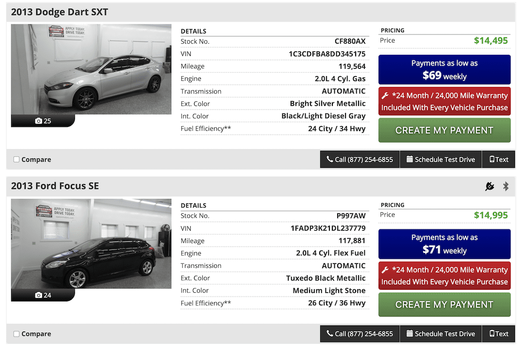
But the real goal for this client was to get their website visitors to start the finance application process to see if they qualified for in-house financing. If they didn’t then it didn’t make sense to have them browsing the cars on the site.
Then I talked to another agency owner at a digital marketing conference in Chicago, and he told me that he only ever sent paid Facebook Ad traffic to custom landing pages.
I figured we’d try it.
LeadPages
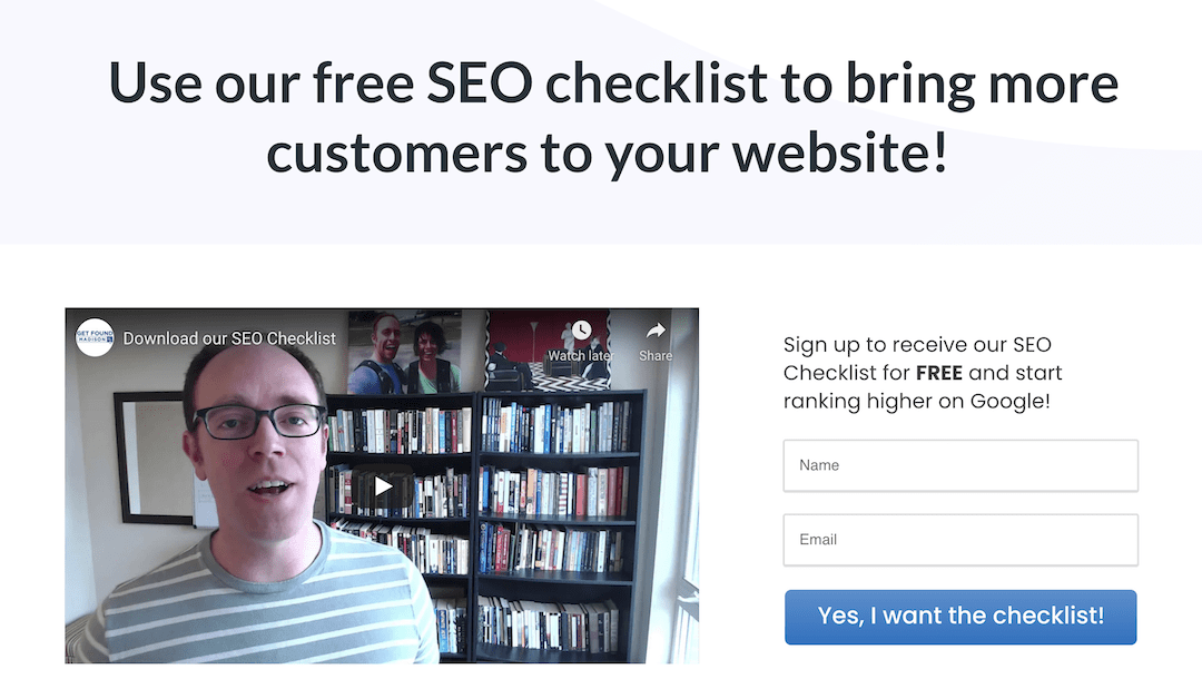
So we signed up for the paid tool LeadPages (there are multiple tools that build landing pages, but this is a good one).
I always like to show people the LeadPages homepage because it exemplifies design that is optimized for conversion.

Notice how:
- The main headline is all about you the visitor, “Turn Clicks into Customers”
- You can see what the tool does without having to scroll down the page
- There is a clear primary Call to Action (CTA), “Start a Free Trial” and a softer secondary CTA, “Watch it Work.”
- The primary CTA has a bright button that stands out on the page to make it clear what you’re supposed to do next and what’s in it for a you (a free trial)
I call these things out because companies like this have already done a ton of testing on their pages and you can learn from and mimic them for free.
So anyway, we built a LeadPage to test sending traffic to instead of their website.
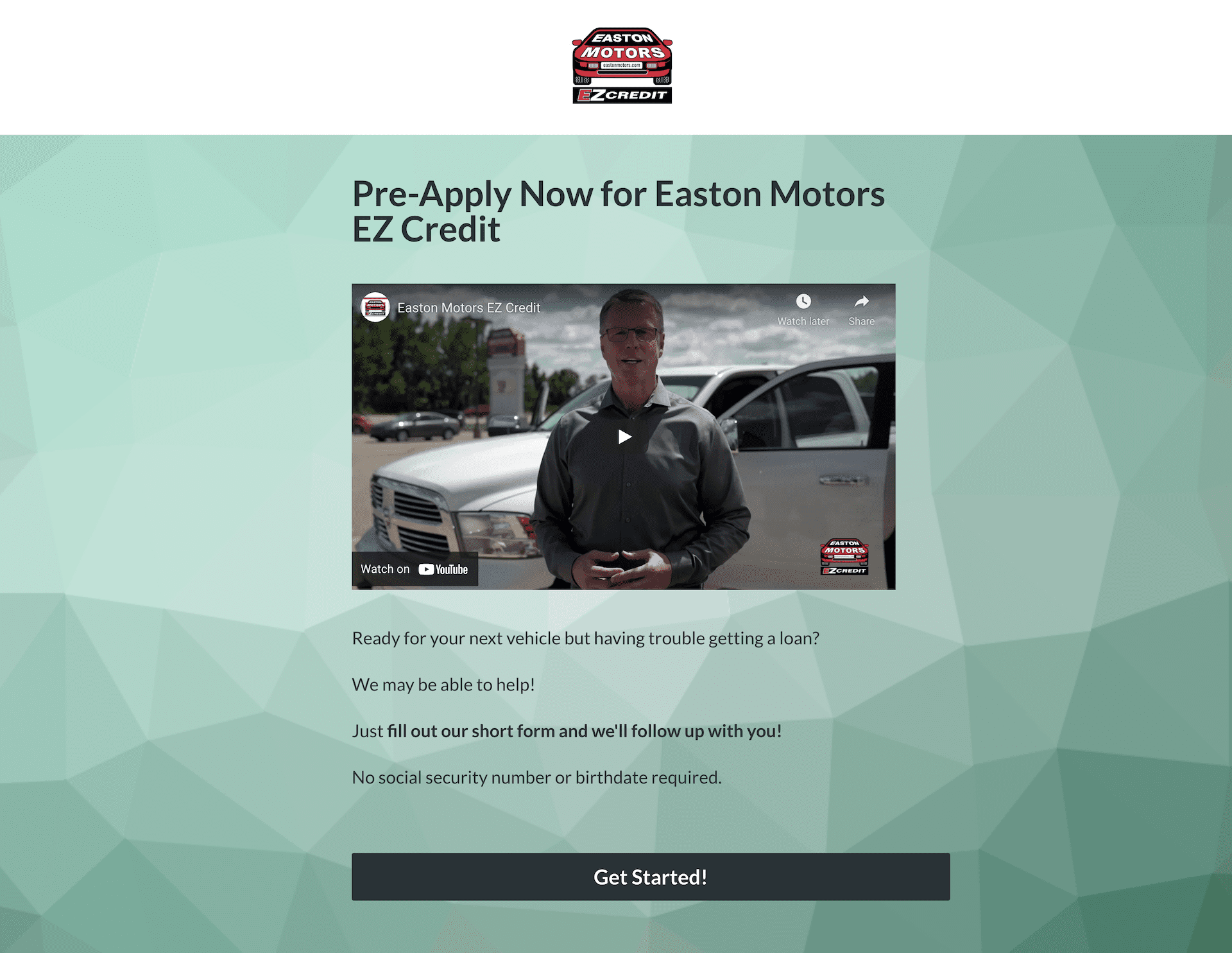
What’s funny is that a graphic designer in the in-person course I was teaching at DreamBank told me this landing page was ugly as sin, which I don’t dispute.
But being of a scientific mind, I told my team to try it anyway.
And let me tell you…the results knocked my socks off.
The Difference a Standalone Landing Page Can Make
In the early days of running paid traffic to this “ugly as sin” landing page, we saw a 20% conversion rate.
As in, we only needed 5 visitors to the page to get someone to fill out the form.
Click. Click. Click. Click. Click. Lead.
Repeat.
When you go from a 5% conversion rate to a 20% conversion rate, yes, you quadruple your conversion rate.
But what matters more is that you chop your cost per conversion by 75%.
You used to need 20 visitors to get a conversion, and now you only need five. Paying for five clicks is much cheaper than paying for 20.
Now…I have to say, 20% is by no means typical. As time went on that conversion rate on that page dropped as we sent more and more traffic to it.
But let me also tell you that before we did this, I didn’t even know a 20% conversion rate was possible! I’d never heard of that before. Moreover, we’ve since tested many landing pages, and almost all of them beat the crap out of the website, which was built to look like other websites instead of built to convert.
We’ve now seen conversion rates ranging from 6-30% with this approach. Even on the low end, that’s better than their website did.
Needless to say, we never went back.
Can this be done in WordPress?
Yes.
We do this using a plugin called CartFlows, but you can also use Thrive themes.
You can see examples here (or under the Learn Digital Marketing menu at the top of this page):
In some cases, we just use CSS to hide our header so users don’t go down the rabbit hole clicking menu options when we just want them to sign up.
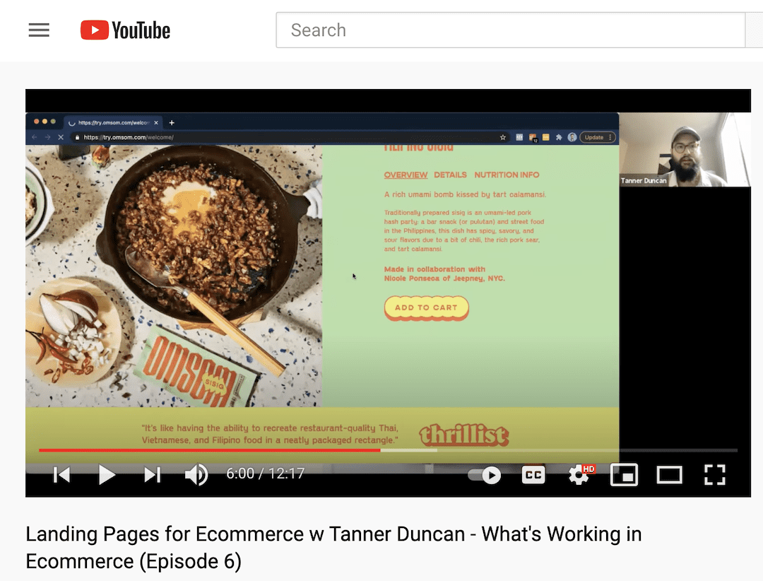
How this Plays Out in Ecommerce
I recently recorded this episode of “What’s Working in Ecommerce?” with Tanner Duncan from Like We Are Friends. This is a YouTube series I’m putting out as our new ecommerce agency brand Caravan Digital.
Conclusion
So what do you think? Are you going to send traffic to your mediocre website or to a page where the visitor can only take one action –> convert?